Twitter always come under a lot of pressure from users for changes to its UI. This week, the humble @ reply was changed to streamline conversations and encourage more replies.
The changes, however, aren’t welcomed by many Twitter users:
new @twitter is a mess. I can't figure out the conversations at all.
— Jamie Klingler (@jamieklingler) March 31, 2017
And it’s not just working out what’s a reply and what’s not, it’s also damaging to brands.
https://twitter.com/lauraolin/status/847612421359325184
How to get back the old Twitter UI
Thankfully, changing back to the old way of viewing tweets isn’t difficult, you just need to download Tweeten for Mac or Windows. If you’d rather not install the desktop software, you can use the Chrome or Microsoft Edge browser plugins instead.
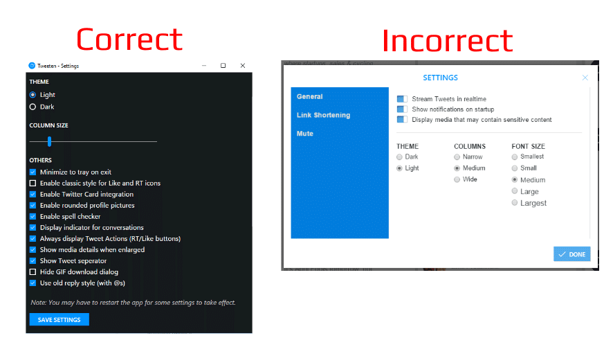
To enable the old style @ replies, or put back the ‘favorite’ rather than ‘like’ button, you need to right-click anywhere within the app. On the Windows version tested, navigating to the ‘Settings’ in the lower-left corner of the app doesn’t bring up the correct options, which is a little confusing. However, right clicking and hitting Settings will bring up the correct panel.
You can see the difference between the new and old style replies shown within Tweeten below.
The candid update note delivered to existing Tweeten users was also appreciated.
– Tweeten [ Windows | Mac | Chrome | Edge]


